Today was the workshop component of the #aeasea conference, as well as the final day. I really enjoyed the whole experience. Even though it was a “web design” conference and I’m not a designer I found most of the content really accessible. There were a few bits and pieces that were a bit too technical for my understanding but I found it really beneficial to get an insider designer perspective and to consider the elements of design and what makes a great website from a different angle.
I think the greatest thing I gained from this conference was real world perspective. Despite knowing there is still a lot of work to do on the Library website, hearing about other people’s experiences and seeing examples of other organisations made me realise that we’re actually doing pretty well and we’re definitely on the right track. I know that our content and our taxonomy especially needs a lot of attention and a heck of a lot of revision, but I can’t sell short the progress we have already made because we are actually on par with many other organisations that are tackling the same kinds of issues as us.
Everyone I met was really lovely and the conference organisers looked after us well. I would definitely recommend any An Event Apart conference to whoever was interested.
Today was a full day workshop with Luke Wroblewski called The Web Everywhere: Multi-Device Web Design. Luke touched on a few more in-depth technical topics as well as covered some broader, more philosophical design ideas and I definitely came away with some great inspirations on how to move forward from here, as well as some potential development ideas that I’d like to explore once I get back (sorry Brendon!).
Here are some of my takeaways:
- You only need to have one design: a multi-device design. You don’t need mobile sites or duplicate content for different devices.
- Content first, navigation second.
- Different types of mobile navigation include bottom bar, toggle menu, off canvas menu.
- Check out Kickstarter mobile site.
- The long scroll is problematic. Off canvas solutions look good and help provide a more streamlined user experience but are there accessibility issues? Explore.
- We need a navigation anchor in our header that takes users directly to bottom navigation, as well as a link in footer to top of page.
- Don’t duplicate menus on the same page.
- Bottom navigation is more optimised for all devices.
- Check out Sony and WWF (especially species page) mobile sites.
- Mobile hubs (pages) not desktop subs (sub navigation).
- Let mobile layouts challenge conventions of where and how navigation works on desktop.
- Look into research around BBC mobile development.
- Apple homepage – vertical and horizontal media queries.
- Derek Featherstone – accessibility guru.
- Microsoft site – good example of responsive site that deals with a lot of content.
- Check out Time Magazine responsive design.
- Content choreography. Arrange content blocks via priority in a mobile environment and reorganise hierarchy based on metrics.
- Check out Children Museum of Pittsburg responsive site that arranges content by priority aligned to visitor metrics.
- IcoMoon – icon fonts.
- RESS – Responsive web design and server side component. Page 157 of handout.
- Native apps = richness, mobile web = reach.
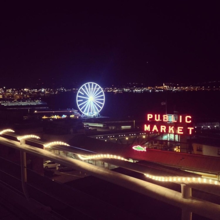
Thank you Seattle, it’s been fantastic! New York, here I come!

