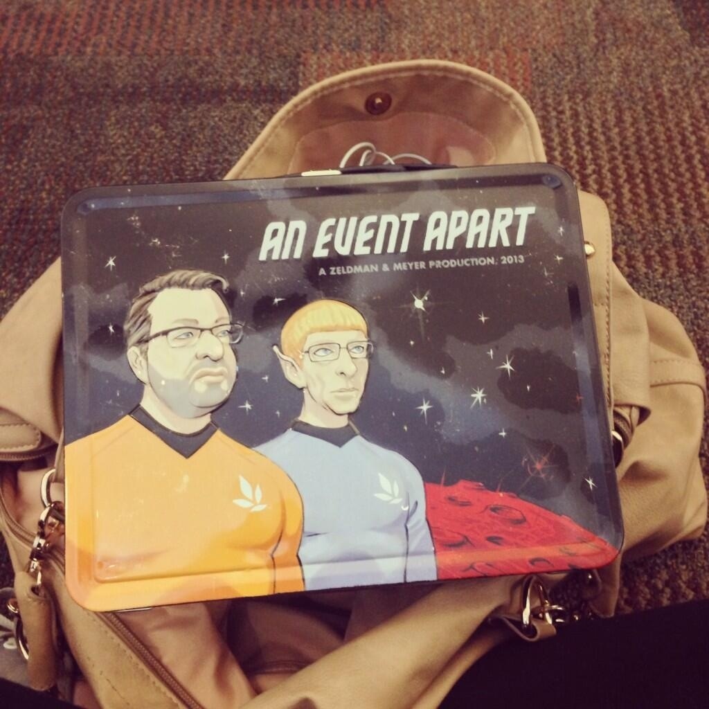
Day One of the #aeasea conference did not disappoint in any aspect. It started off with registration and receiving the best conference pack I’ve ever gotten at any conference or presentation ever (see photos!). Better still was the fact that there was decent coffee that didn’t taste like butt. Always a bonus. The food throughout the day was good (like, actually good). That never happens at conferences. I met the lead UI designer for Hallmark and she interestingly faces some of the same challenges and successes as what we do at the Library when it comes to our online presence so it was really interesting to hear her point of view on issues that we are trying to find the solutions for.
I don’t want to just write here a blow-by-blow of every talk and everything that was said throughout the day. Not only would it take forever but it wouldn’t reflect what I gained from each presenter and wouldn’t help me to reflect on these ideas later down the track so instead I’m just going to share some of my favourite and poignant bits and pieces.
The first talk was “Ten Commandments of Modern Web Design” by Jeffrey Zeldman and it was really great. He is an emphatic and engaging speaker and even though I don’t have a design background I related greatly to his ideas and experience and appreciated his humour and entertainment value. Some paraphrased nuggets from his talk:
- Commandment II: Entertain. Your website should not only be informative but it should entertain and engage audiences via images, graphics, inviting style elements and other pieces of content that give your site and your brand a unique identity. Images can add life and clarity to your content. He gave examples of certain websites that use hand drawn illustrations rather than stock images to convey ideas and themes. The drawings “don’t have to be great” but instead should express some quirkiness or personality and consistency across your website.
- Rather than commenting on your blog posts or webpages, users are more likely to share your content through social media or if they feel passionately enough about it, respond to it via their own blog or site. There is some open-source software for a widget type application that embeds these engagement on your website after each post. So rather than showing only comments left directly on the blog, you can also display other forms of engagement with your content, encounters which are likely to actually be better representations of how users engage with you and your site.
- Test assumptions. Just because some websites do things a certain way doesn’t mean it has to be done like that on yours. Why assume that your site needs a sidebar or needs a navigation tree, for example. If it doesn’t HAVE to be there, then it shouldn’t be.
- Experiments suggest that larger font on a website is more relaxing for the user to read.
- Set a conversational tone with your content. Just because you are giving information doesn’t mean it should be a straight broadcast.
Josh Clark – Designing for Touch.
I saw Josh speak at Web Directions last year in Sydney and he was engaging and thoughtful and had some great ideas. Today was no different and even though he touched on the same ideas as his 2012 Buttons are a Hack presentation, I still came way from it having learnt more and thinking about more new ideas.
- “Every desktop design has to be touch friendly”.
- “Design isn’t just how pixels look but it’s how they feel and you have to design for how hands (mostly thumbs) naturally interact with screens of all sizes. Ergonomics are now incredibly important to web design.”
- Content mantra: clarity trumps density.
- Complexity (in relation to content) is not a dirty word but complexity needs to be managed for users to be able to engage with your content. Progressive Disclosure – giving just a little bit to the user at a time.
- The long scroll is not user friendly. Start to look at “off canvas patterns” where you can navigate content through two dimensional browsing (vertical for important content, horizontal navigation for optional content – pushing it off screen until it is needed).
- “Digital is growing more physical and physical is growing more digital”.
Here are jut a few other extra little notes from some other speakers too:
- Check out calendar app for mobile Google Fight search – Luke Wroblewski
- Hotel Tonight mobile app – great for displaying images full screen and without messiness or excess content – Luke W
- Something to look out for: ePub3: web app where whole publications are published on a website and then downloaded inside your browser in full and is then cached so that you don’t need an internet connection to view it later – Jen Simmons
- check out Teehan+Lax responsive website – Ethan Marcotte


Sounds awesome Jenna – wish I was there – LukeW is one of my usability heroes!